There is a version of almost every app that works correctly but still feels like a prototype. The functionality is there. The logic is sound. But something about it communicates "not finished yet" — and users feel it even if they can't articulate why.
In most cases it comes down to the same five problems.
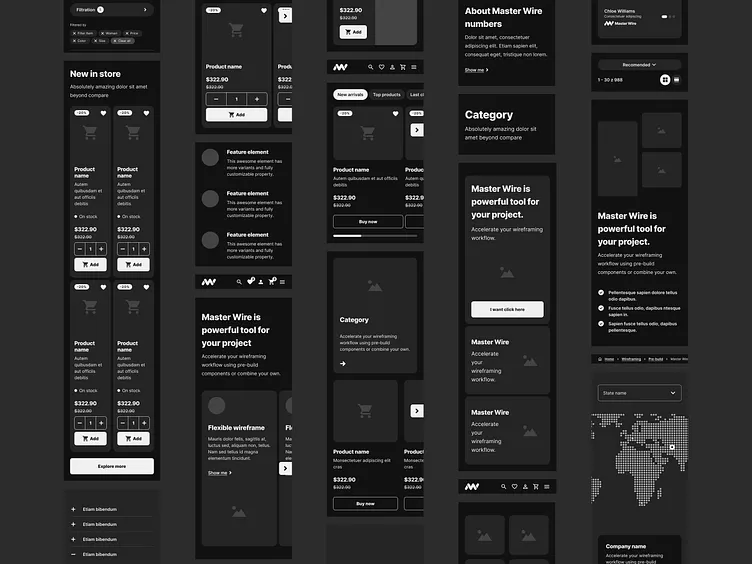
1. Inconsistent Spacing
Nothing signals "this was built incrementally without a system" faster than spacing that varies arbitrarily between components. 12px padding here, 15px there, 20px somewhere else. Define a spacing scale at the start — 4, 8, 12, 16, 24, 32, 48 — and use nothing else. The eye reads consistency as quality.
2. No Loading States
An app that goes blank or freezes while fetching data feels broken, even when it isn't. Every async operation needs a visual response within 100ms. It doesn't have to be elaborate — a subtle skeleton or a spinner is enough. The absence of feedback is what damages trust.
3. Default Browser Focus Styles
Removing outline: none without replacing it with a custom focus style is one of the most common accessibility failures in modern web apps. But even setting that aside — a bright blue browser-default outline appearing on your carefully designed dark interface looks like a bug. Style your focus states intentionally.
4. Typography With No Hierarchy
If your body text, labels, and headings are all the same size with only font-weight to differentiate them, the page reads as flat. A clear hierarchy — three sizes maximum, consistent weight usage, clear color distinction between primary and secondary text — does more for perceived polish than any visual decoration.
5. Error States That Look Like Afterthoughts
Most apps design the happy path beautifully and then add error messages in a red div at the last minute. Error states are moments of user stress — they deserve the same design attention as the rest of the interface. Inline validation, clear messaging about what went wrong and how to fix it, and consistent styling all matter here.
Fix these five things and your app will feel noticeably more finished, without changing a single line of business logic.